The Ideal Mac Keyboard Layout
Motivation
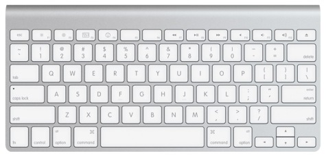
I have a new iMac, and I’m looking for the perfect keyboard for it. The beautifully designed aluminum Bluetooth keyboard that comes with it is great in many ways, but I’m accustomed to the feel of a proper mechanical keyboard, and this mushy, low-travel robber-dome membrane keyboard just won’t cut it.
Unfortunately, there doesn’t seem to be a mechanical keyboard on the market targeting the Mac. I’m going to have to build it. So, what should this keyboard’s layout be?
To start, it needs to have some “multimedia” keys, since there’s no other way to adjust screen brightness and volume on modern Macs, including the eject key (necessary for activating the screen lock, in addition to ejecting the optical media). The playback control keys are also useful.
Ideally, it should be compact, as well. I don’t need a keyboard that sprawls across my entire desk, where real estate is at a premium. In particular, I don’t want a separate numeric keypad on the right; since I use the mouse more often, that’s exactly where I want the mouse. On those occasions where I type lots of numbers, an embedded keypad should do it.
History
To create the ideal Macintosh keyboard layout, we need take a look at where we’ve come from.
First, the original Mac keyboard, the M0110. Observe the beautiful symmetry:
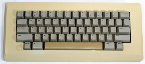
The original Macintosh keyboard, with Alps keyswitches
The bottom three rows are perfectly symmetrical, and the top two rows are mirror images of each other. (Too bad they made the space bar out of a different plastic, and it’s yellowed.)
What it’s lacking for modern use are the function-cum-media-control keys (with attendant Fn key), the escape key, the control key (where the caps lock key is on the keyboard above), the cursor control keys (arrows), eject, and, preferably, the paging keys (PgUp, PgDn, Home, and End). I think those can be added while retaining the symmetry of the main block of keys, and while keeping the entire keyboard very compact.
In fact, I suspect they can all be added and the total footprint made even smaller than the original Mac keyboard, by use of a nice, small margin, like that on the Apple Desktop Bus Keyboard (A9M0330), used with the Apple IIGS and the first ADB-equipped Macs that didn’t get the extended keyboard:
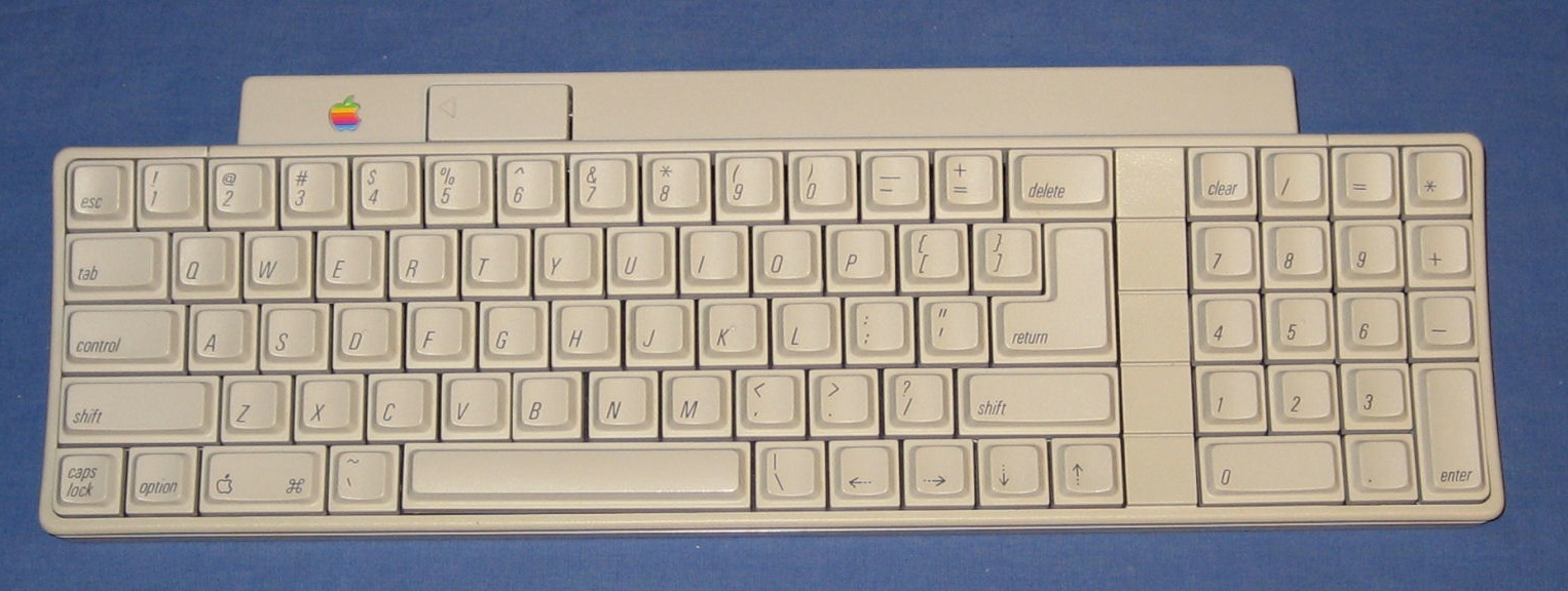
The Apple Desktop Bus Keyboard, with Alps keyswitches
I always loved typing on that keyboard. But I was never really thrilled by the layout. The arrow keys, in particular, were difficult to use.
There are also the Apple Extended Keyboard II and the current Mac wireless keyboard to consider:
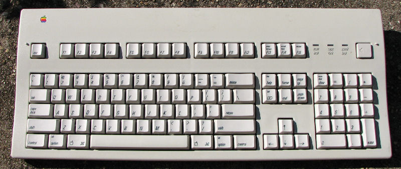
The Apple Extended Keyboard II, with Alps keyswitches
The Apple Wireless Keyboard, with scissor-keycaps on a membrane
The Apple Extended Keyboard II was often called the “Battleship” because of its great size. The other Apple keyboards were much more minimal, which I think is appropriate. Steve Jobs reportedly hated the Battleship. But it did feel nice to type on.
Picky Key Placement
I’ve used a wide range of keyboards in the past decades, and they have varied quite a bit in the layout of the keys around the basic set of letters. The earliest home computers (including the popular C-64 and TI’s 99-4/A) varied most strikingly. Sun had their own take, while DEC’s VT line most closely resembled the modern “US Standard” layout (sometimes called ANSI, although I wonder whether ANSI actually standardized the keyboard layout).
With the exception of the Control key, the placement of all these keys seems mostly a matter of personal preference. I can understand the desire to have the Escape key readily accessible in the number row, but I/m willing to relegate it to the Function key row in order not to have an awkward placement of the backtick/tilde key and for similarity with the ubiquitous “Standard US” layout.
Why did I say “with the exception of the Control key,” above? I’ve been a Mac user since 1984, but I’ve also been a Unix user since around the same time. And Macintosh has been Unix-based for over a decade, now. So you know the Control key has got to be to the left of the “A.” Anything else is just punishing to the poor pinky finger.
For this to be a proper Mac keyboard, of course, the Command keys should immediately surround the space bar and be a bit wider than 1x, and the Option keys should be just outside those and 1x wide.
The Ideal Layout
Now it’s time to put it all together.
So, things I want to keep from the original design:
- 7x Space bar
- 1.5x Command key
- 1x Option key
- 1.75x Return key
- 2.25x Right Shift
- 1.5x Delete/Backspace key (just the one; no Del or Ins)
Features I’d like to retain from the next several generations of Mac keyboards and Unix keyboards:
- Control key to the left of A
Features I’d like to retain from newer designs:
- F1-F12 keys above numbers, spaced in groups of 4
- “Multimedia” keys superimposed on F1-F12
- Escape at top left (above `~ key, although traditional Unix keyboards put it where the `~ key is on AT-based keyboards)
- Eject key at top right (important for modern Macs)
- Forward-Del available via Fn-Backspace
Novel features:
- Fn key at bottom left, but no Control key there
- 1x cursor keys nestled into lower right, with left arrow in the equivalent position to the Fn on the opposite side of the keyboard
- Switchable modes: F1-F12 act as function keys (Fn selects media keys) or the reverse, for switching between Macs and Linux/other use
Cosmetic touches:
It would be nice to have the modifier keys, control keys (Return, Backspace, Esc, arrows, PgUp, PgDn, Home, End), and the middle group of function keys in a slightly darker color, like the original IBM keyboards. I think this is a really nice look, and functional, as well.
And here’s what it would look like:
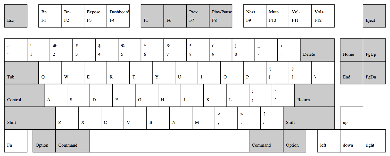
My ideal compact Mac keyboard, option 1
Or this even more compact version:
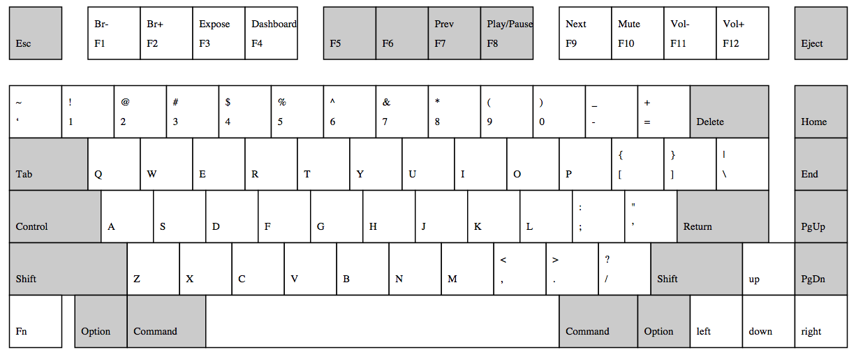
My ideal compact Mac keyboard, option 2
In this second version, the right Shift key is a little smaller, and the only thing separating the arrow keys is the visual color distinction—all to save 0.75x key width total. Is this compromise worth it?
Note that I’ve placed the multimedia control keys in the same place as on the current Mac wireless keyboard and current Mac laptops. (The F5 and F6 keys have the keyboard backlight controls on laptops.) With the Function keys grouped as they are, though, (and since I don’t intend to backlight this keyboard) it would probably make more sense to Prev/Play/Pause/next group one key to the left.
The easiest way I could think to draw those layouts was in PostScript. The results are actual-size, too, unless your printer is inaccurate. The source files are available here and here if you’d like to develop your own or to print them.